The project work and readings I have done this semester really show me how there is no one singular best approach to design. For the entire life cycle of our project, we have had to make numerous big and small decisions, whether it is about which techniques we should use to gather information, how we should prototype our design, or which tasks we should prioritize designing for. As such, it is clear to me that the trajectories of different design projects tend to diverge tremendously, depending on the immediate as well as long-term goals of each project. Thus, this requires designers to be extremely flexible, analytical and clear-headed. Regardless of the goal and form of a project, there are five principles that I identify as the core tenets of a good design process:
- Ethical consideration should be part of the base requirements of any project.
- Multimodality is an important strategy for accessibility.
- Constant iteration allows designers to explore ideas rapidly and quickly spot problems.
- To optimize usability testing and contextual inquiry, be adaptable.
- While designing interfaces and experiences, think minimalism.
Ethics as Part of Base Requirements
Any design project begins with goal-setting, both through initial brainstorming and then through goal-refining after ample user interviews and contextual inquiry. More often than not, ethical implication is included in the set of project goals only as an afterthought, after everything else has been determined. To avoid designing products with ethically dubious features, it is important to incorporate ethical questions right from the beginning.
Of course, considering the vagueness of current ethical standards - especially for new, emerging fields and industries - it is likely impossible to fully predict the ethical implication of a design product. There are cases where a corporation’s law-defying effort is pretty conspicuous (such as Uber’s Greyball), but there are also instances where certain business strategies unknowingly lead to ethically ambiguous consequences (such as Strava or Amazon Mechanical Turk).
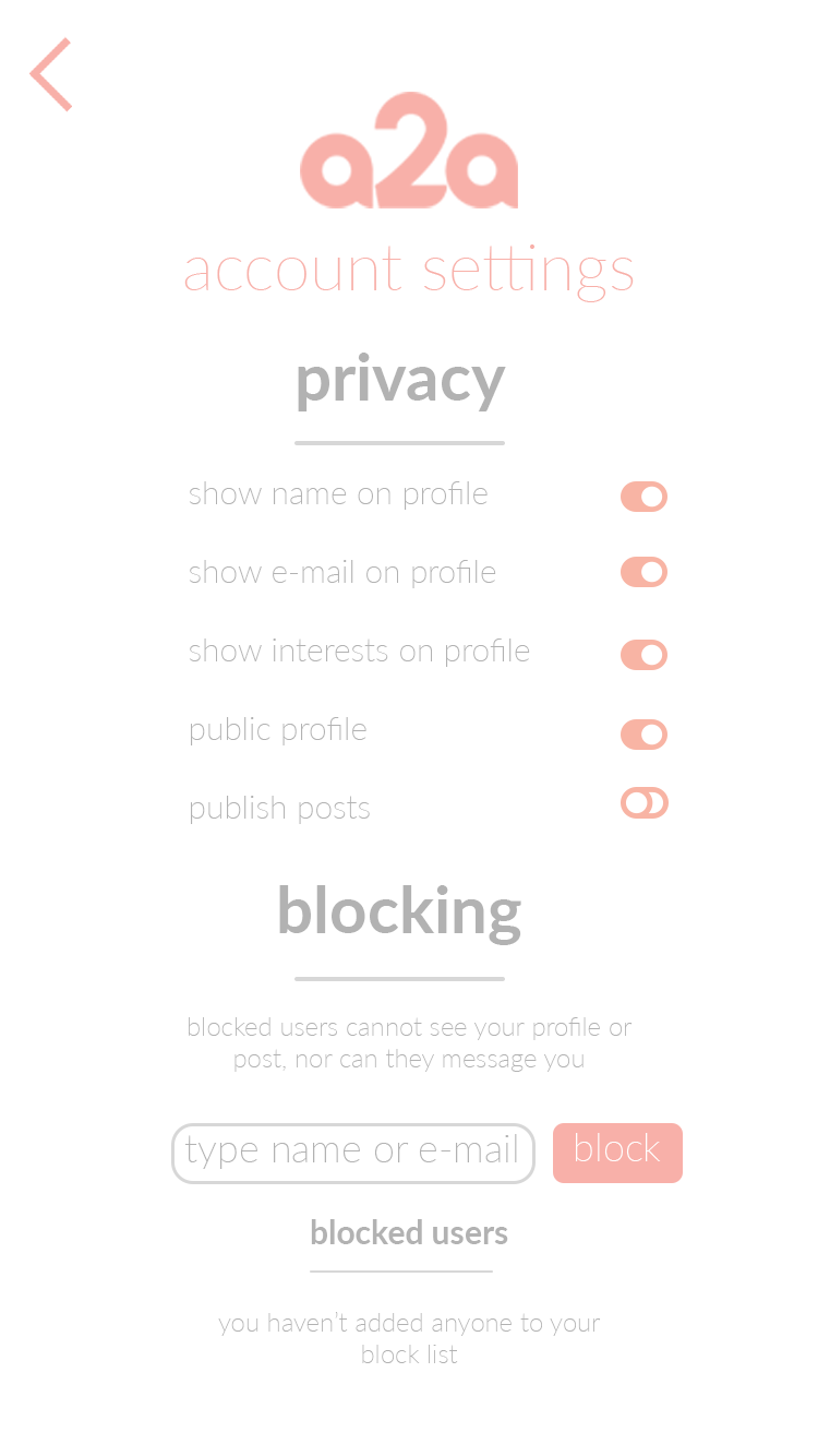
However, such impossibility does not excuse us from not trying our best to take into account possible repercussions of our design. For our project a2a, one of the key element that my teammates and I discussed about a lot is user’s privacy. As an app that allows users to host their own art portfolio and publicize new contents on an art feed, users’ control over their own data is important. This is most clear in our “Privacy” page, where users could monitor which personally identifiable information to be displayed, as well as block other users.
Such a privacy feature is part of a bigger discussion we had regarding how the art feed should be populated. We were considering two options. On one hand, if we set the feed to be contact-based, then the artworks populating it would strictly come from users who are “Friends” with the current user. This provides more privacy, but also diminishes the potential for users to discover new local artists. On the other hand, if we the set the feed to be location-based, then it would be populated with artworks posted within a certain radius around the current user. Artists would be able to publicize their work more effectively, but are also afforded less privacy. We have not arrived at a proper set of policies for our design, partly because of the limited time we have at hand, but one possible solution is that users would discover artworks posted by all members of the community (even people they are not “Friends” with), but artworks from “Friends” would receive higher priority and would appear first on the feed. During the entire design process, it has been important for us to constantly ponder these ethical questions, so that our app does not achieve other goals while compromising users’ rights.
Multimodality and Accessibility
Like ethics, accessibility should actually be taken into account right from the beginning of the design process. This is to ensure that we do not end up a product that works very well, but only works for a segment of able-bodied target users.
Our project group unfortunately learnt about accessibility concepts a bit too late into the process. Our pitch website would likely benefit more from such knowledge, as the website design is not yet very elaborate and hence easily changed. Some of the steps that we are considering right now include adding alt text to every photos used, providing a transcript to our video, as well as adopting a highly minimalist, legible visual style. These steps are all inspired by the “Dos and don’ts of designing for accessibility” reading, which exposed us to strategies to accommodate individuals with sight, hearing, and mental disabilities. In general, an overarching theme is the use of multimodal interaction, in which the same output has different representations (eg. photo information as both pixels and text) so as to not exclude any user groups.
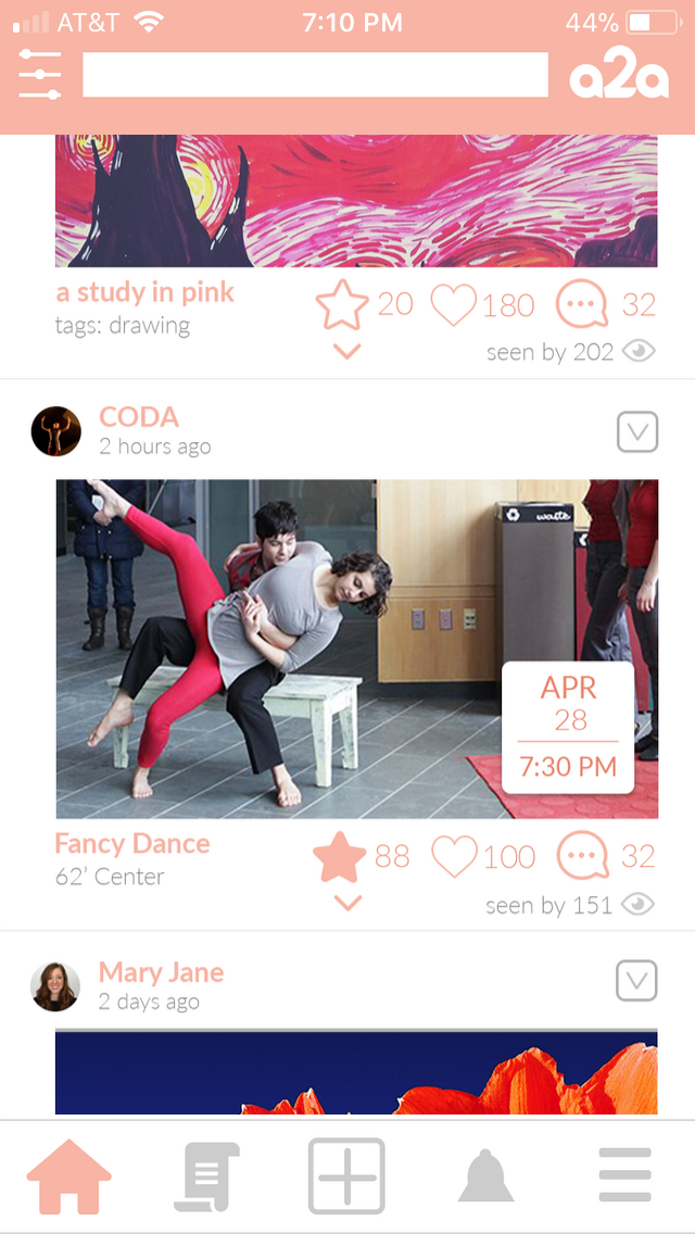
We were considering this multimodal strategy, too, for our app interface, especially with regards to the use of icons. Icons are great because they enable instant recognition of certain features for long-time users, or for users migrating from apps with similar visual vocabulary to ours. At the same time, such a non-text medium exclude visually impaired users; we are planning to provide alt text for icons to alleviate this.
Additionally, since at times the function of a single icon could be ambiguous (eg. does an “eye” icon mean “Watch/Follow”, or “Seen by”?), we were also experimenting with completely replacing our “Follow” icon with an explicit “Follow” text. All of these considerations to switch between different modes are meant to make sure that our app is as accessible as possible.
Constant Iteration is Key
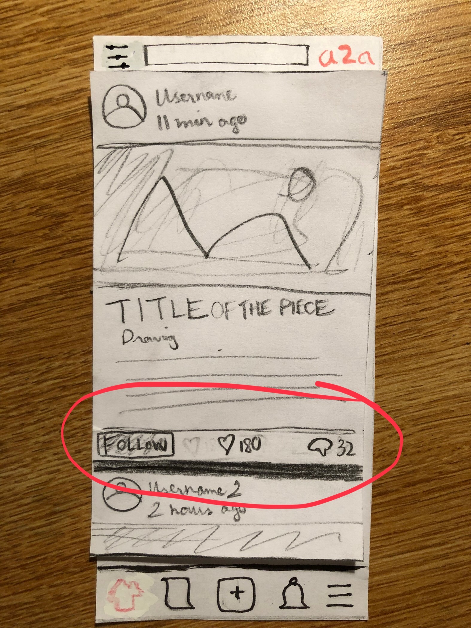
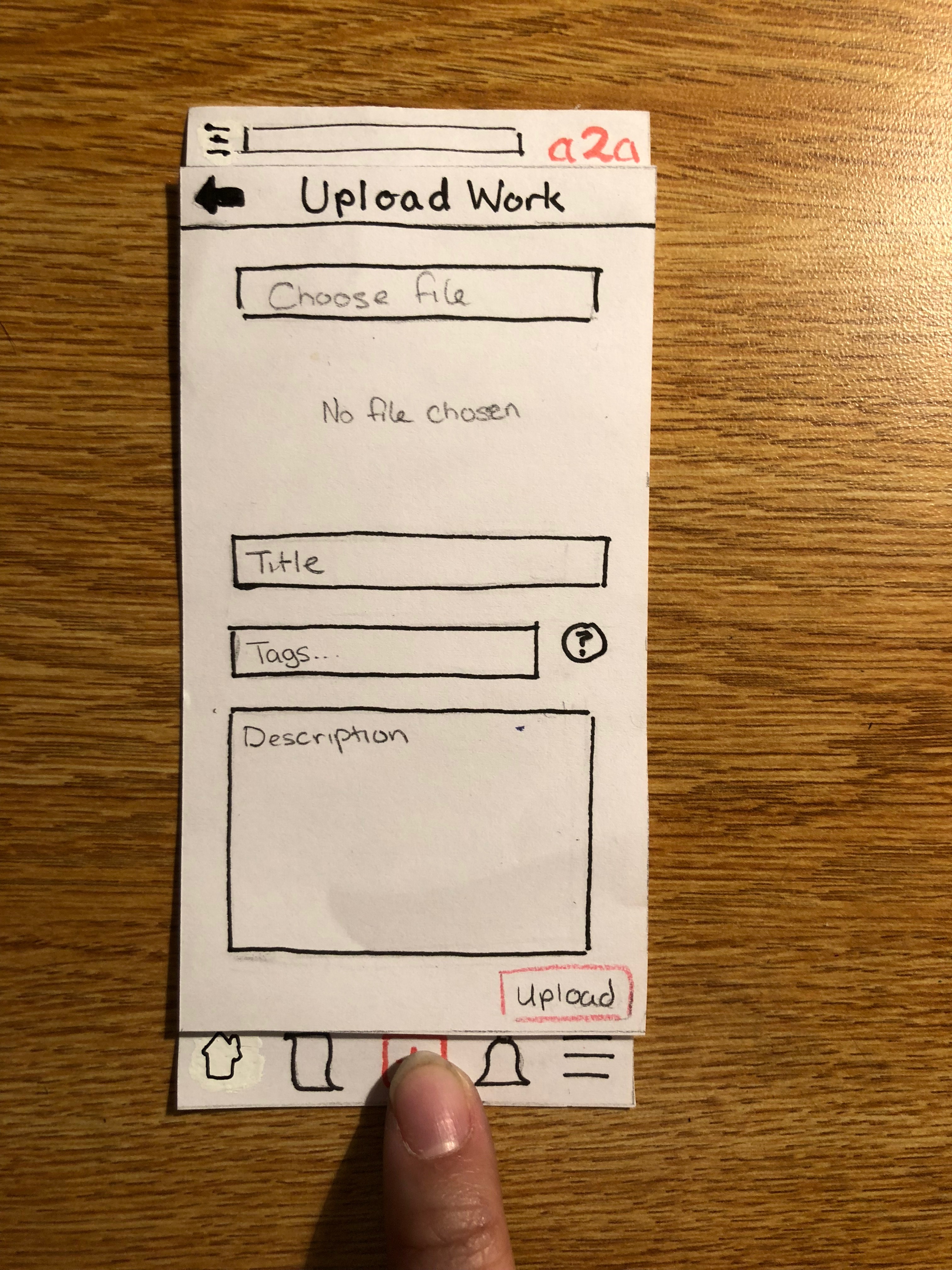
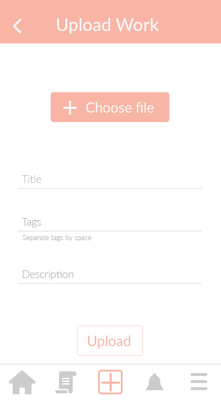
Constant iteration is truly the single most important aspect of the entire design process. I found the rapidity of this technique extremely important, as it enables designers to consider a lot of different possible designs, while not getting too bogged down by the detail of each design, as it is likely that most of them would be dropped anyway. For our project, my team and I iterated and tested our prototypes many times, each time gaining more information on which aspect of our design to focus and which one to trash. A case in point is our “Upload” interface. Our initial paper prototype for this interface would contain a “Camera” function, which later was proven to be redundant. We updated this in our final paper prototype, and then in the end the overall interface is simplified further, resulting in a clean, minimalist digital prototype. As all of these prototypes are relatively quick to build, they allowed us to replace and consider many ideas with ease.

Constant iteration, as illustrated above, also includes constant testing. My team and I got to apply different strategies, such as usability testing and heuristic evaluation, to efficiently test our features straight away. This really assisted us in spotting problems in our design early. For example, a lot of users’ confusion with interactive icons emerged in the initial round of testing, which allowed us to make changes quickly as well as test out those changes.
Be Adaptable During Contextual Inquiry and Testing
Important as testing and contextual inquiry are, it is really difficult to develop good questions or guiding hints for these tasks. For contextual inquiry, too general a question might miss the important insight that we are trying to extract, whereas too specific a question might bias users’ answers. For testing, a general, vague instruction to perform a task might create unwanted confusion, whereas hints that are too detailed would be counterintuitive to the purpose of the test.
In general, my group and I realize that at times, we tend to be more on the general side of these facilitating verbal cues. As an example, for our first usability test, we gave our user - KY - too vague a task instruction, resulting in them wandered around our interface aimlessly, exploring different features before eventually completing the task. For later tests, we modified our instruction such that it clearly outlined what kind of tasks users are supposed to complete. This provided better structure for our tests, and we also gathered feedback that are more relevant to the features we are testing.
Similarly, for contextual inquiry, in our first session with KS, we did not manage to catch some opportunities where we could ask clarifying questions that would explore in more detail KS’s workflow to explore the art scene on campus. Later contextual inquiries are markedly improved, as we slowly identified different potential areas of interest in a user’s workflow. Clearly, there are so many ways to structure these informative interaction with our users, and it is important to be prepared and constantly adapt our approach so as to make the most out of these opportunities.
Minimalist Vocabulary
Even though most lo-fi prototyping process typically calls for quick sketching, as big ideas are more important at this stage, I find that prototypes of all levels of fidelity benefit a lot from good visual design choices from the get-go. In fact, most important sets of design principles (my favorite is definitely Gestalt Principles, for their intuitiveness) make no mention about fidelity level. As such, it is so crucial that we think about good design practices all the time as we begin to prototype our product. For all of a2a’s prototypes, we strive for a minimalist visual interface. This style is my favorite, most probably because of its alignment with a lot of Gestalt principles: by stripping away embellishments that are unnecessary for the user tasks, we emphasize the most elementary building blocks of good visual design, such as proximity and symmetry. This is evident in how we group our icons according to their functions (either in the bottom tab or within each feed post) and also in how we use similar typeface but with different colors and font effects to maintain visual grouping.
Minimalist design also satisfies a lot of different usability heuristics. For example, our design utilize a limited palette of two colors, one typeface, mostly un-bevelled rectangular and round shapes, as well as similar input text boxes. All of these elements ensure visual consistency, clear function mapping, and optimal readability.
Conclusion
It is very hard to pinpoint one specific thing that makes the tools I learnt this semester useful and translatable for other design projects. It anything, the breadth of the techniques available out there testifies to the fact that design is not one single task, but an entire process in which each task corroborates another in a meaningful way. I also learnt that it is so so important to maintain a user-centered approach throughout the entire process, so that the final product not only affords users relevant, desired functionalities, but also strongly upholds ethical and accessibility standards.