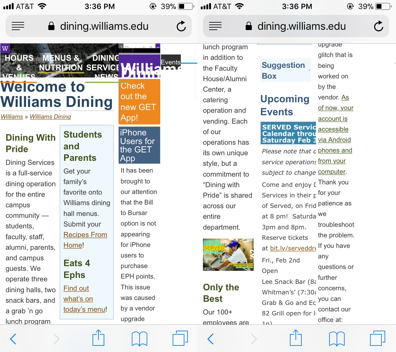
What?
The Williams Dining website provides information on the dining services at Williams including open hours, menu, amongst other things. The site works fine on computer browsers, but falls apart when accessed via mobile devices.
Why is it not great?
Buttons and texts just collapse onto each other on the site’s mobile version, obstructing user’s access to the site information (its affordance). Moreover, information is presented in columns that stretches across the horizontal dimension of the mobile screen. As all mobile devices have screen with greater vertical dimension compared to horizontal dimension (which is opposite to computer screen), this is not an efficient use of screen real estate, making information less accessible.